UA
MAPMYRUN
VISUAL
REFRESH
In early 2020 we set out to redesign MapMyRun to be more in line with Under Armour’s brand guidelines.
The plan was to first establish a strong visual direction. Then from there, create a digital styleguide based on the Brand Styleguide and coordinate with engineering to build a functional design system.
Then, of course, just redesign every screen in the app.
Objectives
Update MapMyRun styling to better reflect Under Armour’s style. Aligning with UA more closely will reflect consistency that will build trust and extend into UA story telling and loyalty.
Measures of Success
• UA affinity: screens will be recognized as UA
• Positive sentiment to existing user base
• Maintains usability
• Stands out vs competition
• Appears as family with UA properties
• Provides a platform for loyalty / marketing
Concepting and Testing
Initial concept work was led by our design manager. The full design team participated in workshops sketching potential ideas and collecting inspiration.
Concepts were organized into 3 directions.
Each senior designer on the team took a direction to build out for testing. I took on the “Challenger” direction.
Qualitative user and stake holder interview testing was done for each direction. With “Challenger” resonating the most.
From there I took the lead on consolidating all of the designs from each direction and producing a set of final screens representing a more complete vision of what the “Challenger” direction could look like.
For this, it was a matter of really pushing the bold visual language of Under Armour as much as we could while still allowing for flexible, user friendly, scalable app functionality.
This collection of screens was used to present to and align stake holders on this new direction.
Below you can see side by side examples of the new visual update on the left screen and the old design on the right.
Final collection of concept screens I designed
The Work
After getting alignment and buy in from all the stakeholders, it was time to turn all of the conceptual visual work into functional design.
Under Armour had a very extensive and detailed design guide, but didn’t have any guidelines for native mobile experience. Over the years, we had iterated on various app design systems but this would be the first time collaborating at this scale with engineering and marketing.
So we started with looking through the latest brand guidelines and comparing them to what we had existing on the app side of things.
After the foundational type and color systems were in place, I went through and updated all of the existing app components for both iOS and Android.
Most of our components had already been built in Figma with design best practices based on the Apple HIG and Google Material Design systems. But since this was our first stab at developing these components into a code library, this work involved a lot of coordinating with engineering to make sure we had a smooth process for getting these base components implemented in a way that both teams were happy with.
Updated iOS base components
The majority of the work involved taking the color and type guides from brand and running them through accessibility processes to make sure they would work well in our mobile app experiences.
Fortunately, a mostly red, black and white palette was easy to meet contrast standards. But the type guidelines needed to be updated to not use so many condensed fonts, and updates to spacing on sizing on smaller fonts to be readable on mobile devices.
I built on top of our existing app design system and coordinated with engineering to finalize the naming and structure of the library so that it would be accurately reflected in the code base.
This cross team collaboration work took the form of weekly check ins, but also lots of documentation using Confluence.
Typically, acceptance criteria would be written by our product manager with input from myself and the engineering leads.
Then I would document before and after designs with direct links to the appropriate Figma files. Figma files would include more detailed design notes, but confluence served all teams best as a source of truth that we could all edit and reference as we moved through production.
Final Designs
Our process for implementing the new design system started with our most simple screens that were made up of basic list views or collection views. This allowed us a low impact way to make sure all the color and type libraries were hooked up and working as expected.
After, those initial screens were implemented. We went onto every other screen in the app. Mostly prioritized by complexity and available team resources as we went.
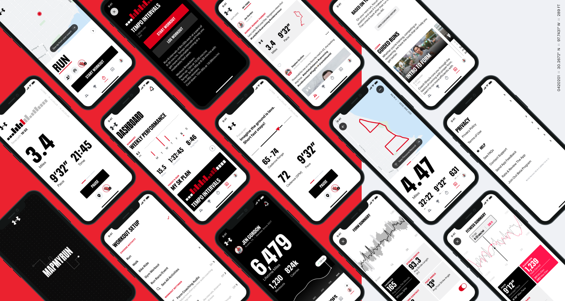
Here you can see a collection of a lot of the screens. I was lead and primary designer for all of this work. These screens reflect the iOS version of the app, but I also created distinct Android screens for that platform following more Material Design patterns as well.
Reflections
Over the years I had taken part in or led previous redesign efforts with varying goals, from just general refreshes, to slowly aligning the app and Under Armour branding.
This latest large scale effort couldn’t have happened without the previous efforts and what we learned a long the way.
Going into this one, we knew we needed a much more collaborative approach with engineering. Working directly with them early on and for each step on this one made a huge difference in people able to clean up a lot of design and tech debt in old libraries and set us up for much easier quality updates.
Large redesign efforts that take place on both design and engineering sides, take a lot of time. This effort took the better part of a year and a half. Partially because it’s hard to prioritize a large project that doesn’t directly influence business goals. So we had to balance this with our main projects.
But with effective communication and strong leadership alignment, we we're able to succeed and really get the app in a great spot for the future.


